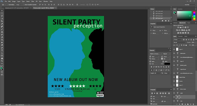
Today I continued to edit my print products, with specific emphasis on my promo poster. Firstly, from my target audience I collated I realised I needed to experiment with different fonts. For the band name, I decided the font was too formal due to the serif font and instead chose a san-serif one that looks similar to that used for "Bloc Party". Because a similar font is used for an existing Indie Rock band I know it would be popular with fans of the genre, and it is appropriate for the music. I also like the font because it is quite bold and so whilst looking informal, it's still quite in your face and makes a statement, which accurately sums up the Indie Rock genre. For the album name I also tried a variety of fonts in order to see which worked best (as seen below). In the end I decided on the top one, because it is also sans-serif and quite bold which means it creates coherence with the band name font. But at the same time it still looks a bit different, meaning they can be distinguished and are not identical.
In regards ro my promo poster, I then changed the fonts that I had now decided on. My audience feedback also suggested I add some quotes from the reviews and so while I played around with a quote under each one I decided it made the poster look too cluttered (and my target audience liked the simplicity) and so decided to only use the one quote in the centre. I then also added some logos like the Itunes and record label, to add to the realistic look of the poster. And then to create balance of the layout I added some social network addresses to the left of the poster.


No comments:
Post a Comment