Friday, 29 January 2016

Final audience feedback


Music Video
  1. Are there any music videos that come to mind whilst watching mine? 
  2. What music genre do you think the video would fit with? Why?
  3. Can you explain what is happening in the narrative? What do you think of the overall narrative? Is it too extreme?
  4. Are the locations used all appropriate? If we were to film the video again, are there any we could change? Why?
  5. Does the editing match the beat of the song?

Print-products

  1. What features can you identify that link the print products (poster and digipak) to the music video you have watched? Do you think the products are identifiable as part of the same promotional package?
  2. Do the fonts I have used represent the Indie Rock genre? 
  3. Is there any part of the print-work that you dislike, or would change if you could?
  4. Is the photography used in the digipak continuous with the poster and video? 
  5. Would you describe the products as redundant (predictable) or entropic (different and unpredictable)? What is your reasoning?


Time Management

I have now completed all of my practical coursework tasks and have uploaded them onto my blog. The next stage will be to start my evaluation. I will also need to gain some audience feedback for my finished products from members of my chosen target audience; this I will plan to do on Friday during the lesson.

Wednesday, 27 January 2016

Digipak and lyric booklet print-out


In order to see what my products would actually look like in the physical form, I decided to print them off, cut them out and fold them. The pictures below show what they look like:


Friday, 22 January 2016

Print work- editing in progress


Here I have been working on an extra element for my digipak. From my research I noted that quite a lot of digipaks have lyric booklets or pages, like MGMT. First, I decided to type all the names of the songs from the back cover in a green font that I've already used to create coherence.Rather than type the words in no specific order and spread them around the page, this I think connotes the idea of not conforming which is a key theme of the Indie genre. I then typed 'lyrics' from the songs, and moved them around to try and create visual interest. Finally, I experimented with changing the background of the page. I then decided on having half black and half white, becasue it matches my established theme of having different sides to people.

Tuesday, 19 January 2016

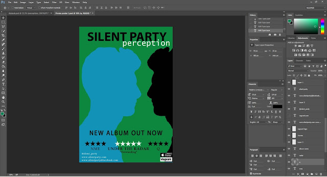
 Today I continued to edit my print products, with specific emphasis on my promo poster. Firstly, from my target audience I collated I realised I needed to experiment with different fonts. For the band name, I decided the font was too formal due to the serif font and instead chose a san-serif one that looks similar to that used for "Bloc Party". Because a similar font is used for an existing Indie Rock band I know it would be popular with fans of the genre, and it is appropriate for the music. I also like the font because it is quite bold and so whilst looking informal, it's still quite in your face and makes a statement, which accurately sums up the Indie Rock genre. For the album name I also tried a variety of fonts in order to see which worked best (as seen below). In the end I decided on the top one, because it is also sans-serif and quite bold which means it creates coherence with the band name font. But at the same time it still looks a bit different, meaning they can be distinguished and are not identical.


In regards ro my promo poster, I then changed the fonts that I had now decided on. My audience feedback also suggested I add some quotes from the reviews and so while I played around with a quote under each one I decided it made the poster look too cluttered (and my target audience liked the simplicity) and so decided to only use the one quote in the centre. I then also added some logos like the Itunes and record label, to add to the realistic look of the poster. And then to create balance of the layout I added some social network addresses to the left of the poster. 


Friday, 15 January 2016

Audience feedback for my print products

In order to gain some feedback for the first draft of my print products I created a Facebook group and asked the members a series of questions in relation to my products...


This feedback has been really helpful, because I now know some improvements I can make to the products to make them better. My to-do list includes:
  • Review fonts- perhaps too formal
  • Experiment with changing the front cover of digipak so it fits in better with poster
  • Add quotes to the poster
  • Perhaps change the layout of song-list on the back


Theoretical approach to genre

Tuesday, 12 January 2016

Editing in progress


Today has been a really productive day. I have managed to complete a first draft of both of my print products. For the digipak, I copied the silhouettes on the inside pane to the other side and then created a thank you pane too, with the quote "the more I see, the less I am sure I know". This I think adds a more personal touch to the digipak because I've used direct address so it feels like the band is talking to the fans. Then for the promo poster I changed the colour of the background and font to match the digipak and help create a distinct house-style to match the two products together. I then used the silhouettes from the digipak, again creating coherence.

My only concerns at the moment are: the text on the thank you pane which I'm not sure of the size or font and I'm not sure whether the poster links to the digipak enough, because the front cover looks so different. I therefore, will show the drafts to my target audience in order to see what they suggest.

Monday, 11 January 2016

Time Management

Last week was the first week back at college since Christmas, during which I have continued to make progress on my print products in Photoshop, which included editing photos for the digipak and creating the layout for the prom poster. I also went out and took a few more photos I needed for the front cover of my album. The next step, therefore, will be to get some audience feedback on my first drafts so I can make improvements for the final product. I will hopefully do this on Tuesday and then will have finished the final products by the end of Friday. So far I need to: finalise the fonts (as I may be unable to use ones online), add the image to the promo poster, finish two more panes of the digipak.

Institution research

Sunday, 10 January 2016

Photos for my printwork

Powered by emaze

Pitch feedback

In order to gain some audience feedback from our initial ideas we presented our pitch to a focus group of three people who represented our target audience. We then asked them a series of questions (end of the prezi) and recorded their responses:

Tuesday, 5 January 2016

Editing in progress

This is the CD pane of my digipak. By taking a number of different photos of nature and landscape I have created a montage using triangles. I will then use a filter in order to make it more bluey-green and keep with the house style.

Promo poster- editing in progress


Today I have started my promo poster on Photoshop. By looking at existing products I have decided on the language for the poster and on the inclusion of reviews, as a way to persuade people to buy the album. Also to keep a sustained house-style I've used a bluey-green background which is present in my digipak.

Saturday, 2 January 2016

Time Management

The coming week we will be returning to college and so I have organised with Callum (lead singer) for a photo shoot during Tuesday lunch time.Therefore, I will need to make some key decisions about the photography; like costumes, shot types, locations. I will hopefully do this tomorrow or Monday, and so it shouldn't take long. I can then get on with some more editing of my print work and will aim to get a first draft/edit done for the end of the week.

Rough cut audience feedback

In order to get more feedback for our rough cut, I decided to create a facebook group and add people who reflect my average taret audience. Then I put a link to the rough cut on youtube and the questions. Here are some responses...


The general consensus is the ending may only be suitable for a more mature audience, but they do still like it, so we will probably not change it. We just need to make it seem more natural and add more stalking for it to seem a more natural progression. Also we need more shots for it to look more like a music video.