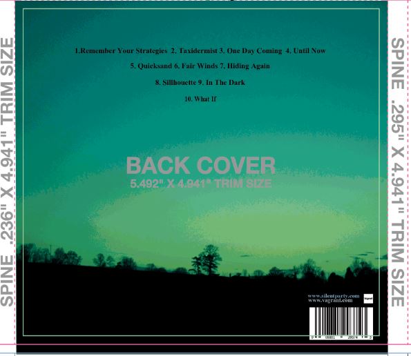
Today I have had a go at starting the back pane of my digipak. I have decided to use a silhouette photo similar to the one used on the MGMT album I have analysed. I then used the channel mixer to make the photo look greener to match my colour scheme and a posterizer, which adds a sort of other worldly look, matching the theme of 'perception' I have decided on. I then created a barcode online and added some website names, which I found was a convention from my research. I also did some research into record labels and have decided upon Vagrant Records which owns The 1975 an English Indie Rock band similar to Silent Party and Bloc Party. Furthermore, Vagrant specialises in Indie Rock and Punk Rock so would have an established fan base meaning people who have hear of the label would be more likely to want to listen to the album.
Tuesday, 29 December 2015
Monday, 14 December 2015
Friday, 11 December 2015
Experimentation of filters
The use of colour filters (pink/purple) could be used to connote an idealistic, perfect relationship at the beginning of the video. If we then don't use the filters later on this will create a definite contrast and make the before and after more clear to the audience.

We also experimented with using brightness and contrast to lighten some of the shots we took during the evening, in poor lighting.

The blur filter could also be used in our music video. We were thinking it could be effective in the stalking scenes because it connotes the warped/distorted way the main character is seeing.

Audience feedback
Today we have gathered some people who represent our target audience and showed them our rough-cut. We then aske them the following questions:
1. What target audience do you think the video would appeal to?
2. Can you describe what's happening in the narrative?
3. Is there enough lip singing?
4. Do you think there's a variety of shot types and camera work used?
5. Would you say the mise-en-scene is appropriate (for the Indie rock genre)? e.g. Locations and costumes
6. What are your thoughts on the ending? 16-25 is our target audience, does this ending seem too explicit for this age range?
The feedback we received was really helpful. It means we can now make changes to the rough cut to ensure the final product will be successful. Some of the changes we will know make are:
- Re-film some of the fighting scenes and change the location to ensure it is more believable
- More lip-synching
- More instrument shots
- Edit to the beat
-Make the break-up clearer

This feedback has been really helpful. It m
1. What target audience do you think the video would appeal to?
2. Can you describe what's happening in the narrative?
3. Is there enough lip singing?
4. Do you think there's a variety of shot types and camera work used?
5. Would you say the mise-en-scene is appropriate (for the Indie rock genre)? e.g. Locations and costumes
6. What are your thoughts on the ending? 16-25 is our target audience, does this ending seem too explicit for this age range?
The feedback we received was really helpful. It means we can now make changes to the rough cut to ensure the final product will be successful. Some of the changes we will know make are:
- Re-film some of the fighting scenes and change the location to ensure it is more believable
- More lip-synching
- More instrument shots
- Edit to the beat
-Make the break-up clearer
This feedback has been really helpful. It m
Tuesday, 8 December 2015
Print work mood board
To help with my print work designing I have created a mood board showing some of my key ideas, colours, fonts and inspiration for my work.
Print work- colours
Using the website http://colorschemedesigner.com/csd-3.5/ I have come up with some different ideas for a colour scheme. The main colour I want to use is dark green and then, as the picture shows, the colours blue yellow and orange can be used to complement it. I have chosen these colours because they are all found in nature but I will make them brighter and more synthetic using Photoshop and adding to my idea of perception because what is common within the Indie Rock genre is entropy.
Print Work Idea
My main idea for the print work is perception...
Definition of perception
I have decided upon this concept because I can explore how things can be interpreted differently by different people, which is linked to our music video because it's the idea of whether the main character is just trying to get over the girl or whether he's gone too far and verged into stalking, hence creating continuity. Furthermore, this concept coincides with the Indie Rock genre because, from my research, I've found the digipaks are often quite entropic and not everything is what it seems.
I am going to present these ideas using a sort of distortion in Photoshop and other interesting editing techniques applied to more natural scenery (which are used within the music video itself).
Subscribe to:
Comments (Atom)


